Western Sydney University Digital Design
I led the project team that reimagined Western Sydney University’s (‘Western’) primary websites, and moved them onto the Adobe suite. The project had 2 major phases, firstly improving the enrolment process and student experience, and secondly improving the experience for future students. During phase 1 I was responsible for the design team and outputs, while in phase 2 I led the entire project team including the development team.
Candidate Selection & Project Approach
Having just invested in the Adobe stack, the first question was ‘where do we start’? We undertook a series of collaborative workshops with Western and the build partner to identify and discuss the various options, analysing pros and cons, and ultimately scoring each candidate, before making the final selection.
We collectively chose to pursue (a) a simplified enrolment process and (b) a personalised student page in phase 1, as they were both relatively low risk and offered significant business benefit.
We formed a dedicated multi-disciplinary team to work on the project, sitting the full project team together in a single location, and working in an Agile framework.
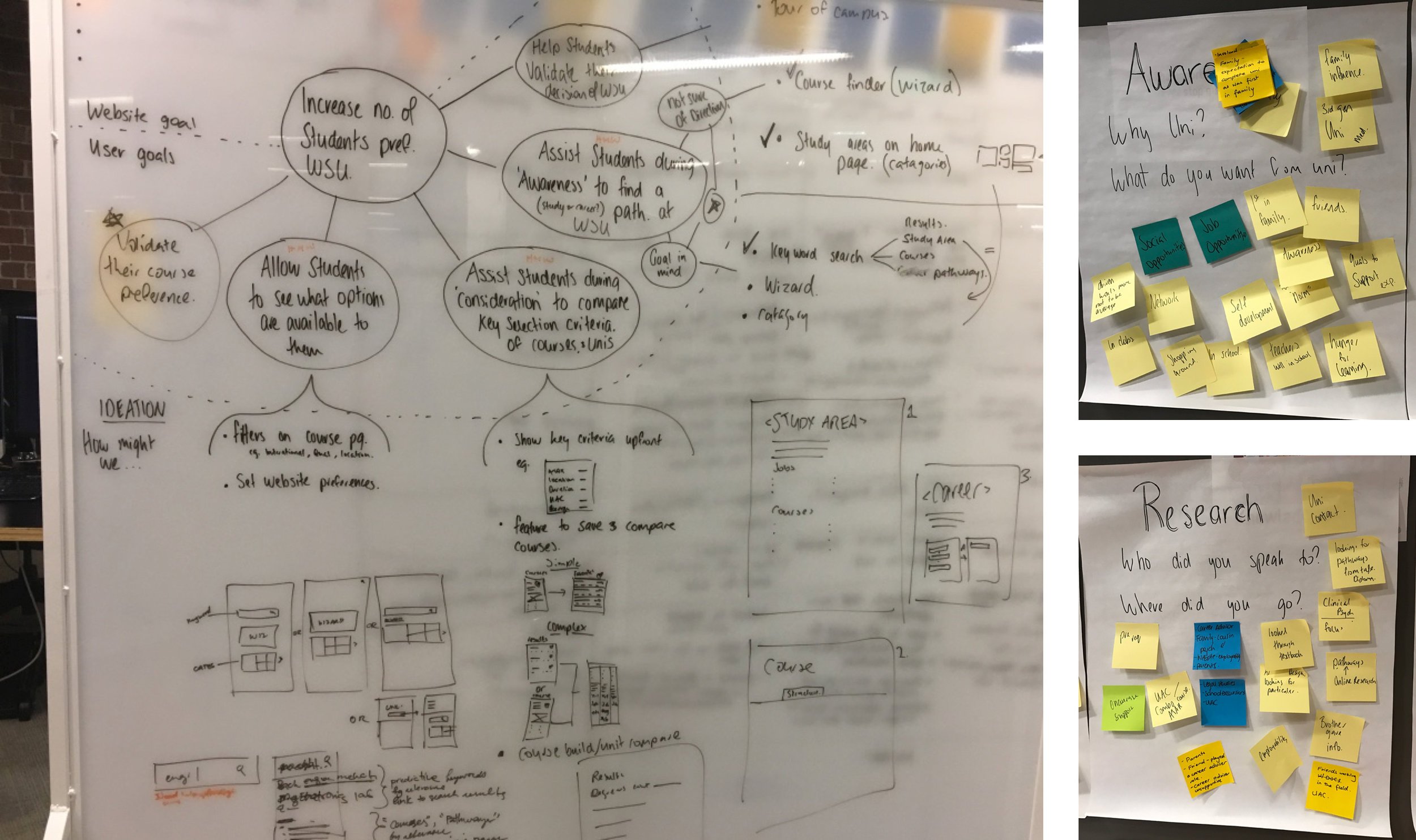
We started with a significant Discovery phase, during which we undertook primary and secondary research, developed personas, documented a prioritised requirements list (backlog), created users flows for both projects and defined what needed to be done.
Phase 1 - MyWestern
The personalised student page was chosen as it could both improve the student experience and reduce early churn. One of the reasons for the early churn is students missing their first couple of assignments, and not adapt well to uni’s more relaxed approach compared to school. Therefore we wanted to create an experience to help students navigate their university life, and make it easy for them to succeed..
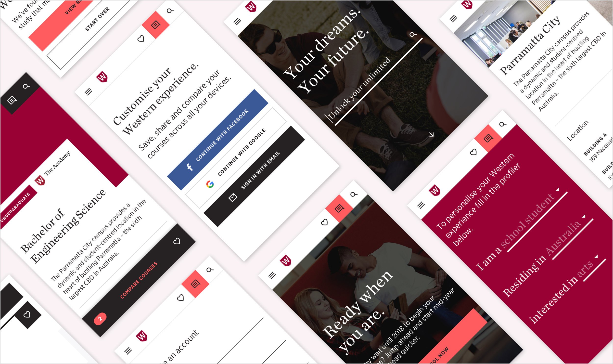
We created ‘MyWestern’, a personalised student dashboard for each student, which delivers relevant messages and helps them navigate their way through what is required of them. They receive reminders about upcoming assignments, can view a timetable with directions to their next class, information about relevant value-add activities from the uni, and messages about social events and on-campus discounts.
In many ways it is like the university equivalent of online banking - a logged in portal with your personal account details.
Given the audience of commencing university students, everything was build ‘mobile first’, with a card based design layout. A fairly detailed tagging system was created to help with navigating around the site.
As it was an early version of AEM, all components had to be designed and built from scratch. Creating MyWestern involved merging 15 student facing systems into one.

Phase 1 - Enrolment
The enrolment process was overly complicated to the extent that potential students were starting to enrol but dropping out along the way as it was too difficult. During our research we heard a number of students saying it was so complex that ‘I cried!’
The enrolment process was difficult, as it touched a number of legacy systems, including admissions, finance, assessment, etc. and you need to do all of those bits first before you do the enrolment process itself.
Using a user centred design approach, we were able to reduce the online enrolment process from 11 steps to 4, and made those 4 steps as simple as possible. This cut out multiple student pain points, and fortunately we were able to collaborate with Western’s internal IT team to navigate the technical challenges.
Data is now captured throughout the enrolment process, meaning that when people drop out, Western now proactively contact those prospects, hold a personal conversation around the course that person has been offered and where they are up to, and asks if they can help the person to complete their enrolment.

Phase 2 - Future Students
After going live with the two Phase 1 candidates, we moved on to tackle the biggest opportunity - future students.
The existing Western website had grown over the years, to the extend that it had over 16,000 pages. However when you search for ‘finance at Western Sydney University’, you were more likely to find someone in the Finance Department responsible for collecting money, rather than information about a course related to finance.
Prospective students were finding it extremely difficult to navigate lengthy course handbooks, decipher university terminology, and work out how to apply.
So our first job was to really understand the needs, behaviours, goals and pain points of potential students, to help decide what content needed to be on the site, and which content needed to be moved elsewhere. We did this through contextual enquires with students, spending time with the call centre, and analysing user behaviour.
One of the interesting things that came out of that research, was that some prospective students know exactly what to study, but others really aren’t sure.
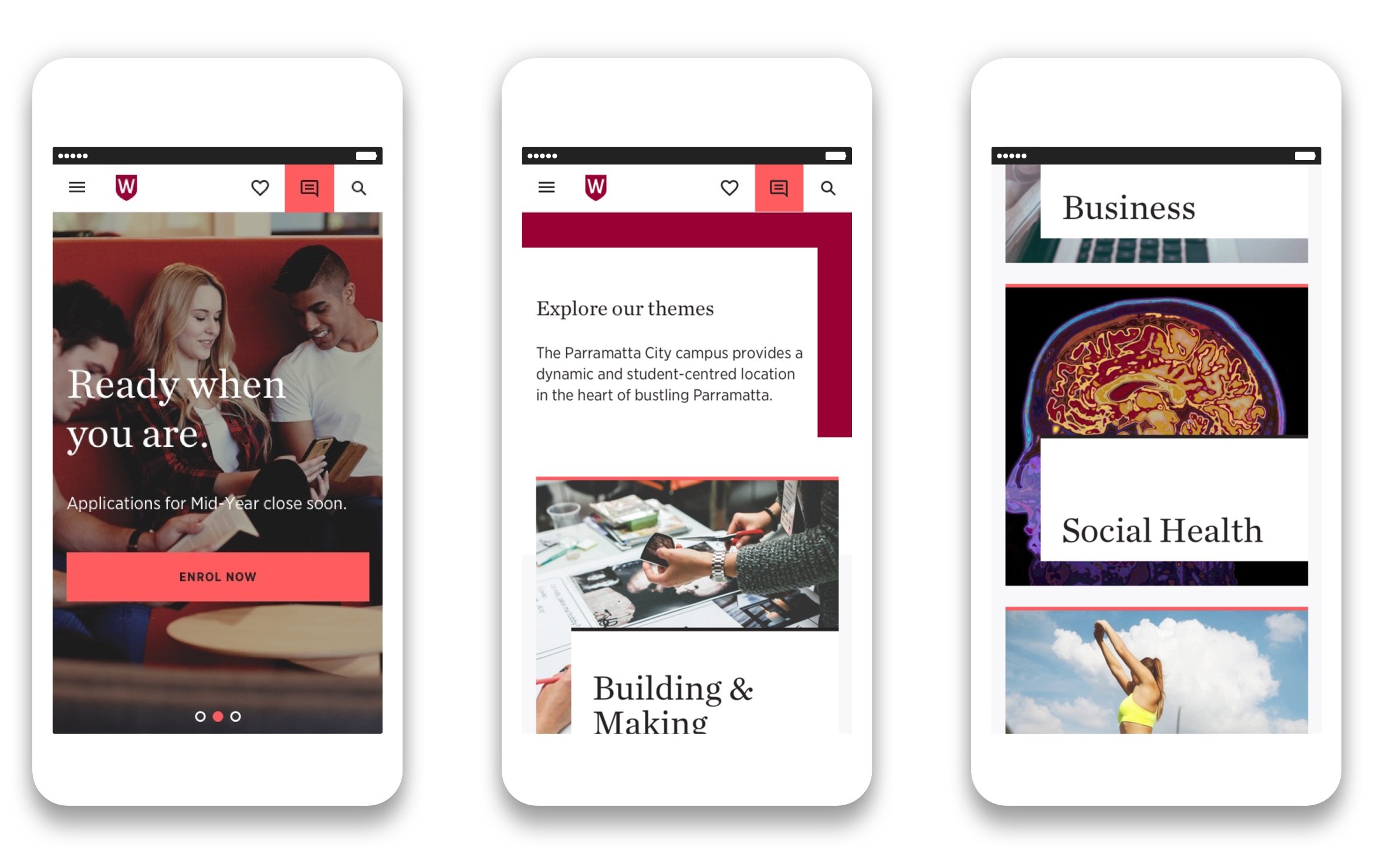
When we moved into define stage of the new Future Students website, this insight became very important. To cater for two very different mindsets and behaviours, we placed search at the top of the Future Students site for those who know what they wanted, and introduced study themes to inspire and interest those who don’t know exactly what they want to do.
These study themes grouped courses in a way they had never been grouped, bringing together courses from different faculties based on analysis of course preference data from UAC over the preceding years. These themes were incorporated into the information architecture and the site’s navigation.
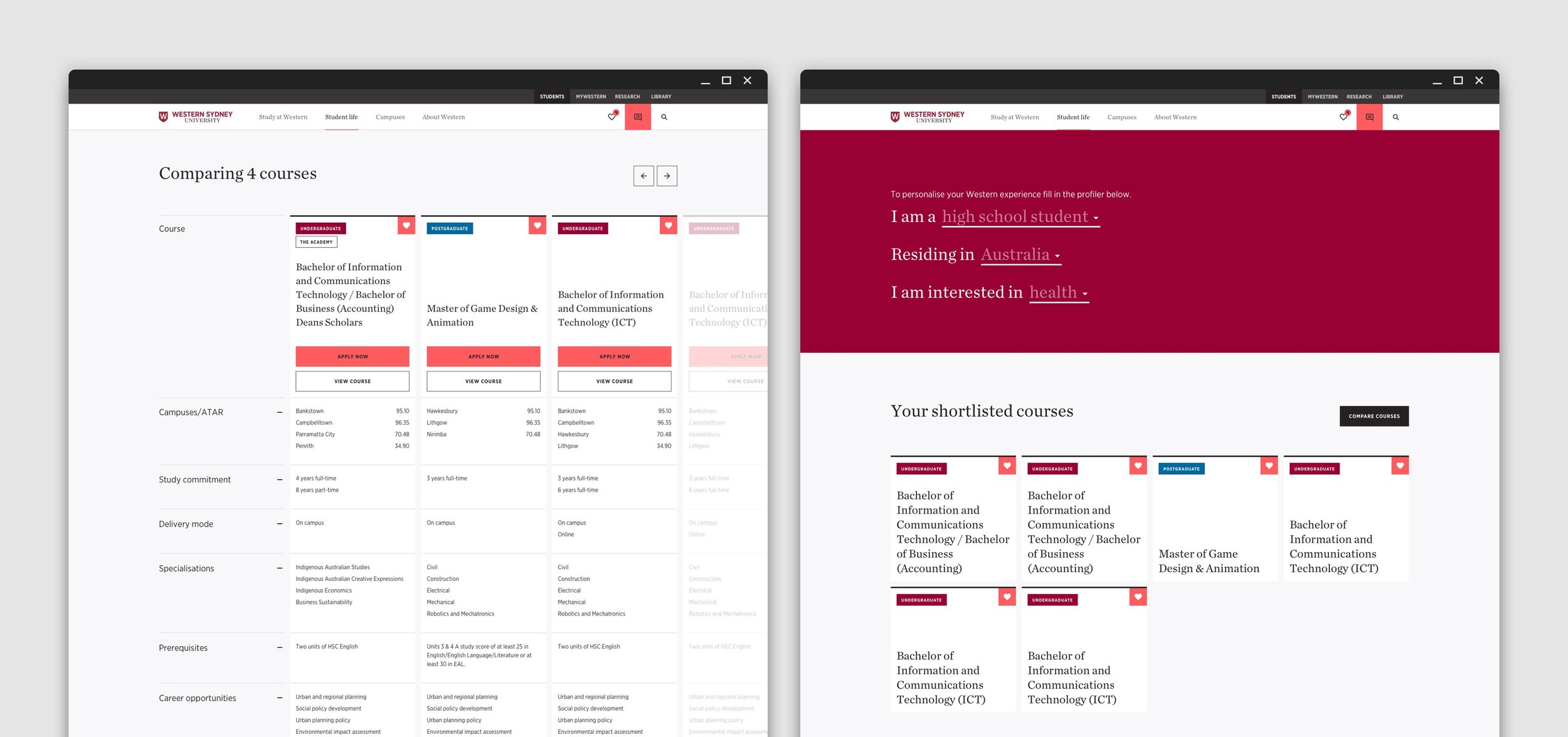
We also made it very easy to compare courses, and to shortlist (or favourite) courses you liked; which solved another pain point we had heard often.
A far greater emphasis was placed on video and 360 degree imagery to help engage prospective students, and convert prospects to applicants.
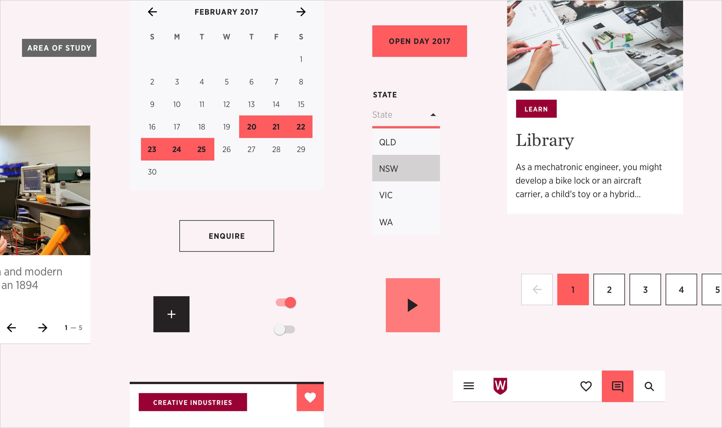
Creating The Design System
As part of the design process, my team created a digital design system for Western that set the foundation for all future digital design. The design system allowed us to improve efficiency in design and development, iterate quickly, create visual consistency and improve usability.
The design system included documented specifications for all components and templates, as well as defining the patterns and styles, such as spacing, grids and metrics. We used colours to differentiate undergrad from post-grad, and this was all defined in the digital style guide which explained the design system.
By working closely with the front-end developers, the team was able to create a design system that delivered brand and user experience consistency, while allowing for scalability and being flexible enough to meet the business needs.
Impact
The evolution of the Western website had an immediate impact, with:
MyWestern being rolled out to all first year students in its first year, making it easier for them to know where they should be at any point in time, what they need to do, and to see relevant content from the moment they commence enrolment. This helped to reduce churn, and was identified by competing universities as a ‘point of strategic advantage’ for Western
Improved conversion percentages in enrolling students through personalised offers and reducing the enrolment process from 11 steps to 4, supported by the new call centre processes, and
Total student numbers increasing from c.41,000 in 2014 to c.50,000 in 2022, despite heavy competition and severe disruption due to COVID.